How (not) to plot your data on a geo map
by Dmitry Bochkov
There is an enormous value in visualizing data on a geographical map.
Most people react very favorably to a product or service when they look at the map that displays total dominance of the said product or service. This phenomenon drives a huge usage of the maps in TV and printed advertisement as well as in the data analytics at every level. We are going to look at some mistakes that may happen when using do-it-yourself data geo-mapping services.
Very often you can see quite a creative approach of using mapping technologies that aims to soften few anomalies in the factual data displayed on the map. For example, most of the cell phone companies cannot boast about good coverage in the Rocky Mountains. There is a very simple visual solution that can be used to demonstrate the reason of those dead spots on the map – use the map texture. For example, look at the terrain texture of a map used by Verizon Wireless in their TV ad in September 2016 (see a screenshot below from https://www.ispot.tv/ad/ANgU/verizon-lte-advanced-iphone-7-on-us ) You would see that most of the gray areas are in the mountainous parts of the country and this is a very good visual explanation (possibly it is just a distraction but it works as well.)
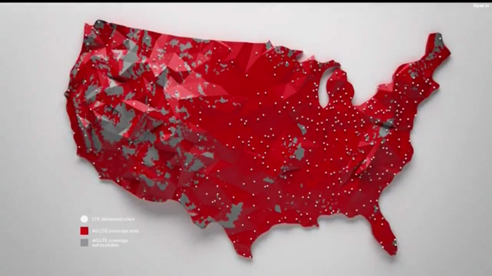 Source: https://www.ispot.tv/ad/ANgU/verizon-lte-advanced-iphone-7-on-us
At the same time, the same organization makes a bad decision in the map used on their web site. Look at the picture retrieved from https://www.verizonwireless.com/landingpages/iphone and try to explain what was a driving force in selecting a red triangles background for the coverage map? The result is a very confusing map that brings consumer’s attention to the locations on the map that do not follow the desired design of data visualization.
 Source: https://www.verizonwireless.com/landingpages/iphone/
The most probable explanation is that the mapping tools available to the visual data designers did not provide an adequate choice of textured layers, neither terrain nor population density nor anything else that could help to visually demonstrate the limited coverage in the specific areas on the map.
While the mistakes with using do-it-yourself geographical maps may be very costly in advertisement, the real cost may come when attempting to use the common geo-mapping tools for the data analytics. How often do you see maps that are overcrowded with the pin points and unnecessary popups? How many hours did your data analysts spend trying to find the correct gradient scale for the non-linearly distributed data on a map? How much effort does it take to create just a couple of synchronized maps?
With Microsoft MapPoint being discontinued almost two years ago, and other tools (either applications or online tools) are being limited in both the amount of data points they are able to display and the number of layers and textures that they support, there are just few options for the scalable data visualization tools.
That being said, the solution to avoid costly data plotting mistakes is to turn the tables. Instead of trying to find business insights by manually plotting your data on a geographical map and scrambling to combine the best layers, try to use a specialized data mapping solution.
At Black Ink, we are not only supporting the most attractive features on the data maps as a part of the EyeOn Map solutions, but we are putting the data first. Our data processing engine can find the deep relationship between products, consumer, industry, demographic, climate, economics and other data in our vast geospatial database, merge it with the customers’ data, and produce the recommended layers on a map, resulting in the clear data driven interactive geographic map experience.
 Source: Black Ink proprietary image